An Innovative Experience for Savr Recipes
A Google Venture Sprint
WHO IS SAVR?
Savr is a start-up recipe company that aims to provide creative and fun recipes that allow its users to enjoy cooking at home.
Savr delivers high-quality recipes for a variety of food types and different skill levels through their Savr mobile app. Savr has an active community of users who rate and review recipes for other users.
SAVR’S PROBLEM
Recently, negative user reviews have indicated that the recipe instructions are unclear and difficult to follow. Despite their high quality, 58% of the users are frustrated following the recipes while cooking.
The frustrated user experience caused user abandonment and hurt the company's 'business model'.
Understanding Finding Issues Design Constraints Mapping Solutions
DAY ONE
USER PERSONA
“ How might we create a recipe following experience that is challenging but enjoyable, so Nick feels proud and confident about the meal he cooked?”
DESIGN CONSTRAINTS
Currently text-based instructions.
Platform: Savr Recipe native iOS mobile app.
Focus on: creating a better instruction following experience.
DAY TWO
Lightning Demos Sketching Selecting Solution Screens
COMPETITOR ANALYSIS
List of required cookware.
List of ingredients ( illustrations).
Step-by-step instructions.
CRAZY 8s IDEATE METHOD
Quickly drawing 8 ideas in 8 minutes, helps to push past the initial idea, and generate a wide variety of recipe-following solutions.
(Screenshot of Crazy 8 sketches)
THE POSSIBLE SOLUTION
Deciding Story Boarding
DAY THREE
DECISION
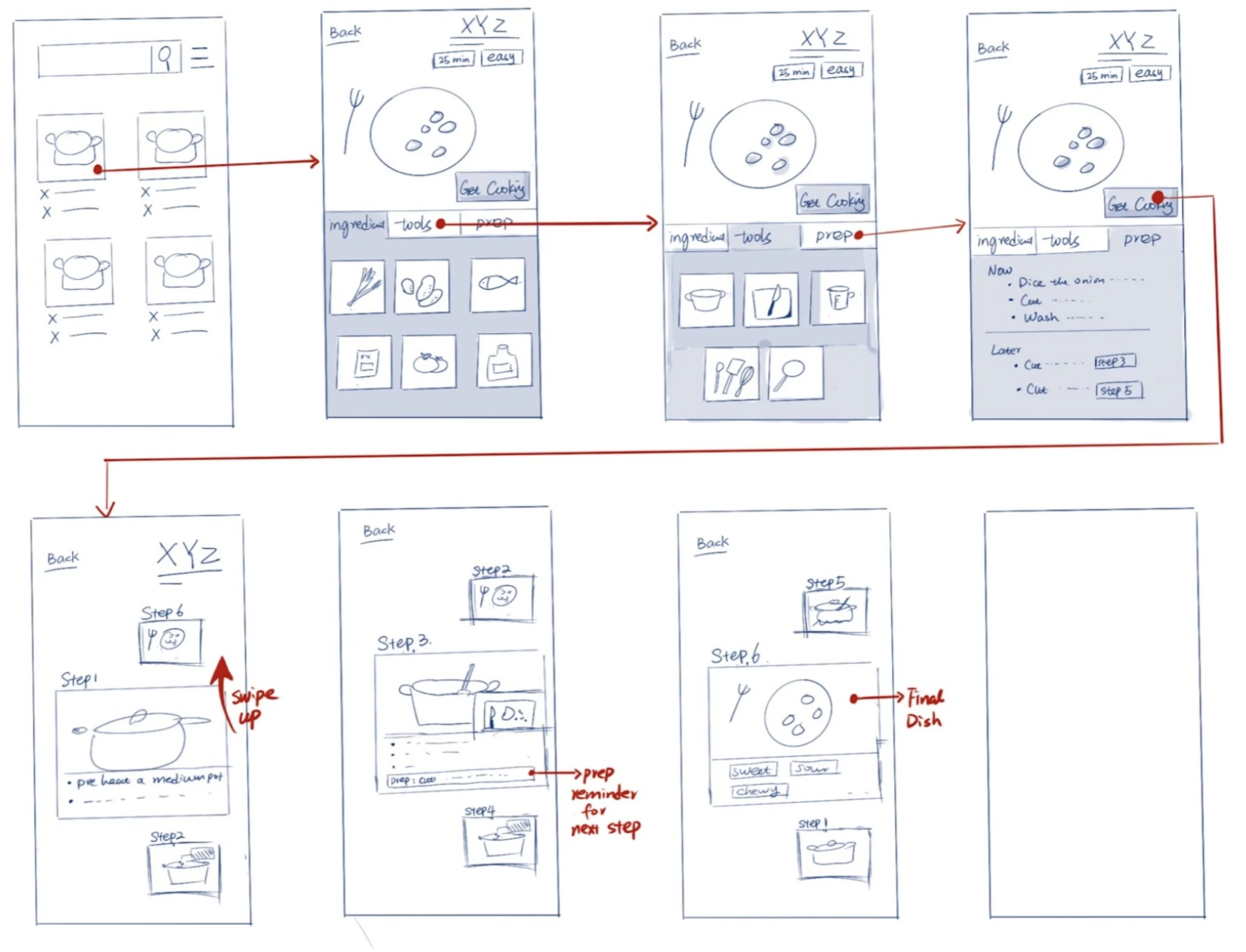
Solution #3 fits Nick’s need most appropriately, because he will be able to:
See previews of all steps while focusing on one step.
Know when is the right time to prepare certain ingredients.
Learn new cooking techniques as he goes.
Nick would first choose a recipe that he is interested in cooking, and read through the ingredients/ tools needed for the dish. When Nick clicks “get cooking”, the app will walk him through each step.
While on each step, he would see both the previous step and the next step. He would be able to know if he is on the right track and always be prepared for the next step.
DAY FOUR
High-Fidelity Screens Prototyping
(High-Fidelity Screens, first version)
DAY FIVE
User Testing Synthesizing Iterating
USABILITY TESTING AND ITERATION
FINAL DESIGN
The Design Sprint process is a very structured design thinking process that can help generate effective, functional solutions, and solves problems in a short amount of time.
With the new recipe and the following experience, Savr will be able to attract more customers and gain back previous customers.
Next iteration: I will add a voice control feature, so the users do not have to rely on operating their devices with their hands while they are busy cooking.
REFLECTION
Pros
Use bold keywords and numbers to indicate the most important information.
Clear step-by-step instructions with both texts and images.
Users can review the cooking experience at the end.
Cons
Does not specify the tool requirements for this recipe.
Pros
Clear presentation of the content, users are able to understand with minimum effort.
straightforward three main sections of “cookware” “ingredients” and “instruction
Cons
No images to compare alongside each cooking step, so users cannot be sure if they are on the right track.
Food Network
Mealime
Tasty
Pros
Video clips alongside each step.
Community involved, users can view how others made this recipe.
Auto calculate ingredient portion by serving numbers.
Cons
The ingredient list is too long and difficult to read.
No cookware list
Estimated time frame for each step.
Comparison with the previous step.
Use of white space, is simple and elegant.
MVP
Possible Solution #1
Turnable methods to view each step during the experience, which Nick can also view the previous and coming steps.
Possible Solution #2
The majority of contents are represented in text and sorted by digital sequence, clear and straightforward to view
Possible Solution #3
Each step has its own page, with images and descriptions in the text.


